GA4 Just Rebuilt Its Reporting Around a '+ Create' Button

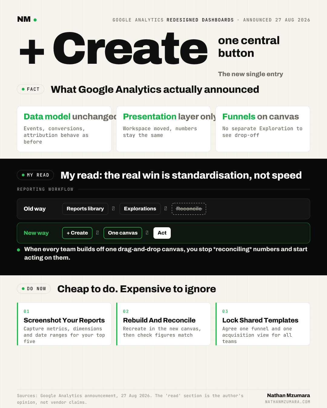
Google Analytics redesigned dashboards are rolling out to all accounts over the next few weeks. Announced by Google Analytics on 27 August 2026, the update rebuilds the reporting workspace around a central '+ Create' button, drag-and-drop layouts and in-dashboard funnels. The data model is unchanged. Only the workspace and how you build views have moved.
What actually changed in the GA4 interface?
The GA4 redesigned dashboards put a '+ Create' button at the centre of the reporting experience. From one place you build, customise and organise your core performance views, rather than jumping between fixed report templates and separate Explorations.
Google describes it as a "streamlined command center" where you assemble insights "in seconds". In practice, that means drag-and-drop cards, reorderable layouts, and funnels that live inside the dashboard instead of a walled-off report type.
The '+ Create' button
The '+ Create' button becomes the single entry point for new dashboards and cards. It replaces the older split between the Reports library and standalone Explorations as the first thing a growth team reaches for each morning.
In-dashboard funnels
Funnels now sit alongside your other cards on the same canvas. A team can view acquisition, engagement and a conversion funnel in one shareable dashboard, without opening a separate Exploration to see where users drop off.
What stays the same in the GA4 data model?
The GA4 data model does not change with this rollout. Events, parameters, conversions, audiences and attribution settings all behave exactly as before. This is a presentation layer update, so historical data and existing definitions carry over untouched.
That distinction matters. A redesigned workspace can move where a metric lives on screen, but it does not alter how that metric is counted. Your numbers should reconcile before and after the switch.
Why does this matter for growth leaders?
For growth teams this is not cosmetic. It changes where people live day to day and how fast they ship a shareable view to the board or the wider business.
- Speed to insight: drag-and-drop dashboards cut the time to build a stakeholder-ready view, so reporting becomes a five-minute task rather than a Monday morning ritual.
- Consistency across teams: a shared dashboard template means marketing, product and finance read the same funnel, not three competing versions of the truth.
- AI-assisted insight in the flow: a unified canvas is where Google's AI-generated insight cards sit inside the workflow, rather than in a panel most people never open.
My read is that the real win is standardisation. When every team builds off one drag-and-drop canvas, you stop reconciling numbers and start acting on them. That is where measurement work in an AI-centric measurement stack pays off.
How to prepare before the rollout hits your account
The rollout is staged over several weeks, so most accounts have a short window to prepare. Use it.
- Screenshot your current core reports. Capture the exact metrics, dimensions and date ranges for your top five reports so you can rebuild them like for like.
- Rebuild in the new canvas as it lands. Recreate each report using the '+ Create' button, then reconcile the numbers against your screenshots to confirm nothing shifted.
- Lock down team-wide dashboard templates. Agree one funnel definition and one acquisition view, build them once, and share as the default across teams.
- Move funnels onto the main dashboard. Bring your key conversion funnel out of Explorations and onto the shared canvas so drop-off is visible at a glance.
- Brief stakeholders. Tell the wider business the layout is changing, not the data, so the first "where did my report go" email does not become a fire drill.
Do the reconciliation step properly. A redesign is the most common moment for a team to quietly break a saved view and only notice a fortnight later. For teams already rethinking how insight surfaces, this pairs well with wider work on how AI systems surface and cite your brand.
The counter-view
Some practitioners worry "streamlined" means "simplified", and that power features get buried for the sake of a cleaner canvas. That concern is fair, and worth watching as the rollout completes. On balance, though, moving funnels and AI insight cards into one workspace looks like consolidation rather than removal. The data model is intact, and that is the part that actually matters.
GA4 redesigned dashboards: the bottom line for teams
GA4 redesigned dashboards change the workflow, not the numbers. Screenshot your reports, rebuild them in the new '+ Create' canvas, reconcile the figures, and agree shared templates before your account flips. Do that this week and the rollout becomes a tidy-up, not a scramble.
Tags